Voyages was styled and designed by my friend of almost 20 years, Priyanka Krishnamohan.
Pri, who is constantly drawing, doodling and pointing out beauty, symmetry and design in places you’d never think to look, graduated from Pratt with a degree in design. She then joined Pearl Fisher working on some of the biggest accounts in the world. If you’ve purchased a Godiva chocolate, a tub of Chobani yoghurt or a McDonald’s happy meal, you’ve come into direct contact with Pri’s creativity.
Back when she was an art student and I was trying to make it as a photographer, Pri designed my first ever logo. I found the actual email dated 19th April 2009, here it is! (note the creative use of negative space in the logo)
When it was time to find someone to help me condense everything I’m trying to convey with Voyages into a clear and powerful visual language that was unique and personal to me, there was only one person I could turn to.
Here is a mockup she built of the Voyages website landing page. This website you’re currently viewing was built by me in squarespace and doesn’t hold a candle to Pri’s vision.
Perhaps in the future if time and money permit I’ll have the website professionally redesigned to Pri’s specifications.
Watching Pri present the logo for the first time over Zoom will remain one of the highlights of my Voyages Journey. I was absolutely blown away. She was able to translate my life as a Sailor and a Pilot into a symbol. She also drew upon the fact that I served as a Meteorological Officer on ships, where my job was to observe, record and then encode weather phenomena into Met Reports.
The Voyages Logo
I’ll walk you through some slides from her presentations and hopefully this will convey to you how the design process unfolded!
Here is Pri’s Concept 1, “Maps”. To a navigator at sea, charts are the tools of the trade. This was before ‘ECDIS’ systems that electronically display charts and other information on a screen. I own a large collection of old Admiralty Charts (and a few issued by other, local authorities) from my days as navigator, which are stored carefully along with my signed Zancan prints.
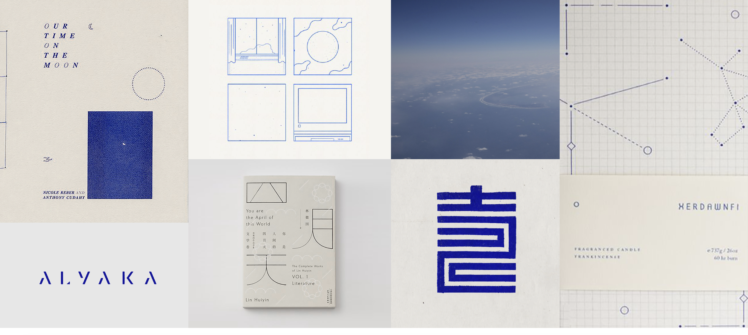
Pri knows I am a massive Japan Fan, I’ve been visiting Japan almost every year since 2001 and speak just enough Japanese to get around. So she incorporated Japanese aesthetics into Concept 2:
Here are both initial concepts side by side :
Pri’s concept 2 caught my eye…
I found myself drawn to this one.
Pri said to give her some time as she worked to develop Concept 2, and a week or so later sent me a presentation that started with this slide:
The fellow with a sheepish smile in this picture is Pri and Matt’s dog Yeti! Yeti and I are good buddies and the moment I saw this picture I knew what the presentation was going to be about: Clouds!
You see my nickname for Yeti is Cloud.
Priyanka had gone right back to the 19th Century, to the origins of Cloud Symbols. The art of Navigation has been practiced by humankind from even before the dawn of civilisation. If a species must forage for food or migrate between climates to survive then that species has to have learned to Navigate.
With organised shipping and trade routes came the need for charts and encoded weather information.
Priyanka studied some of the earliest examples of cloud symbols.
And two of these, by William Clement Lay, caught her attention. Lay’s symbols for Stratus Precipitans and Nimbus clouds!
Pri was able to leave Clement Lay’s Symbol for Nimbus nearly untouched and still find a symbol for an aircraft within it. At this point I had no words.
And there you have it. The Voyages Logo. Designed for Ozark by Priyanka Krishnamohan. Sea, Sky, Clouds, and so much meaning, all packed into one Symbol.


